
Crafting letterforms as pairs and experimenting with contrasts between line weights was a practice to be challenged that broadens one's understanding of typography and its many uses. Through testing how different fonts paired with each other, it was a learning curve to understand that various typefaces not only are used for basic reading and writing, but they also have unique lines and curves which can be cohesive with one another when manipulated. Through the use of Proxima Nova, thin italic and Adobe Jenson, semibold italic caption, font was sized up and down to create patterns within a single composition that displayed contrast in line weight as well as form.
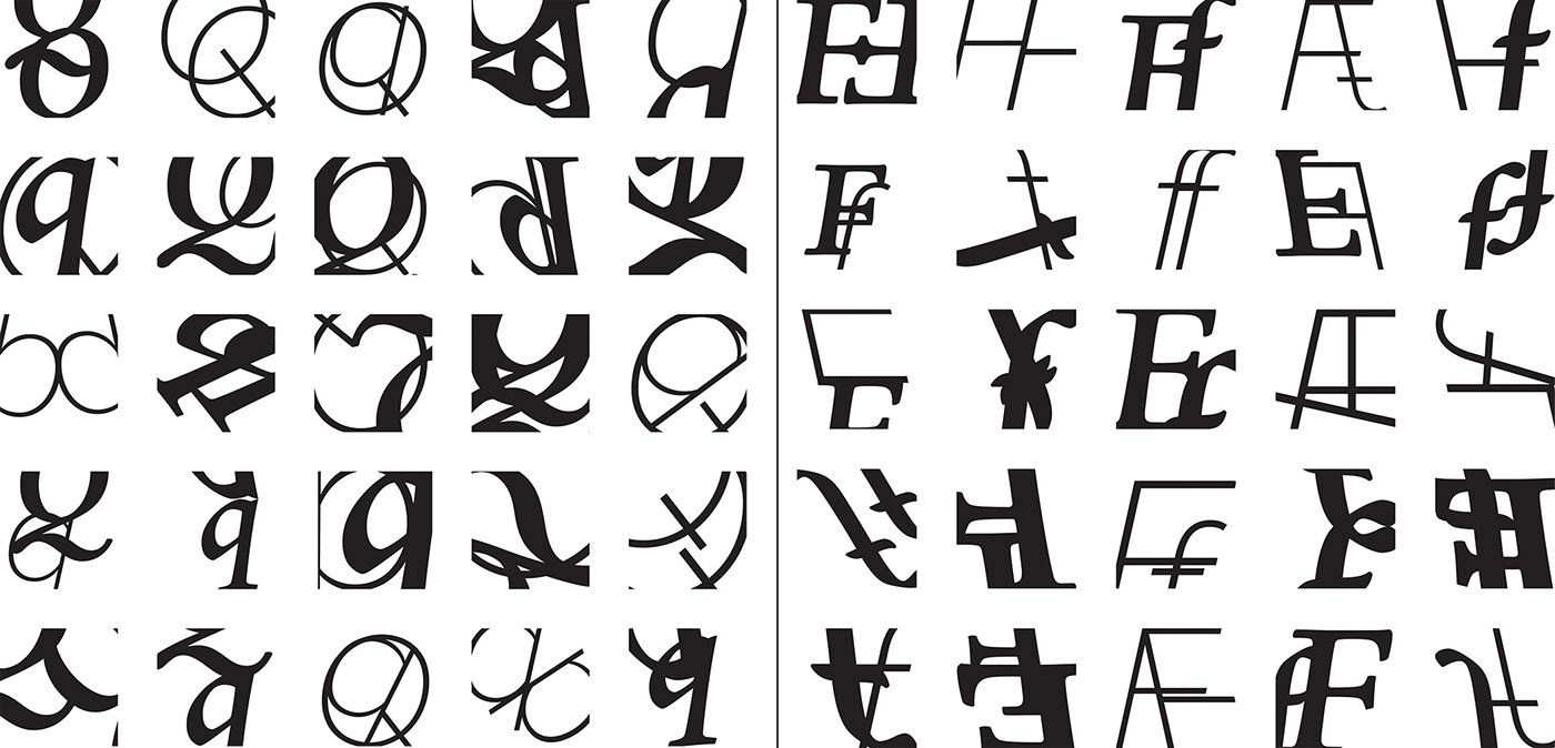


Pictured here is 5 different iterations of which were chosen to display contrast between typography. Through using letter pairings of Q, X, J and U, forms were created that either showed apparent contrast between line weights or fit well together to show how different fonts could interact with each other in terms of placement or rotation.

Displayed next is the five final letter pairings. Each of these pairings shows a contrast in size, weight and rotation. Here, we are able to see that various fonts in the same letter can have a completely different appearance depending on their design, and may even give off the assumption that they are not fonts, yet an abstract design.

